
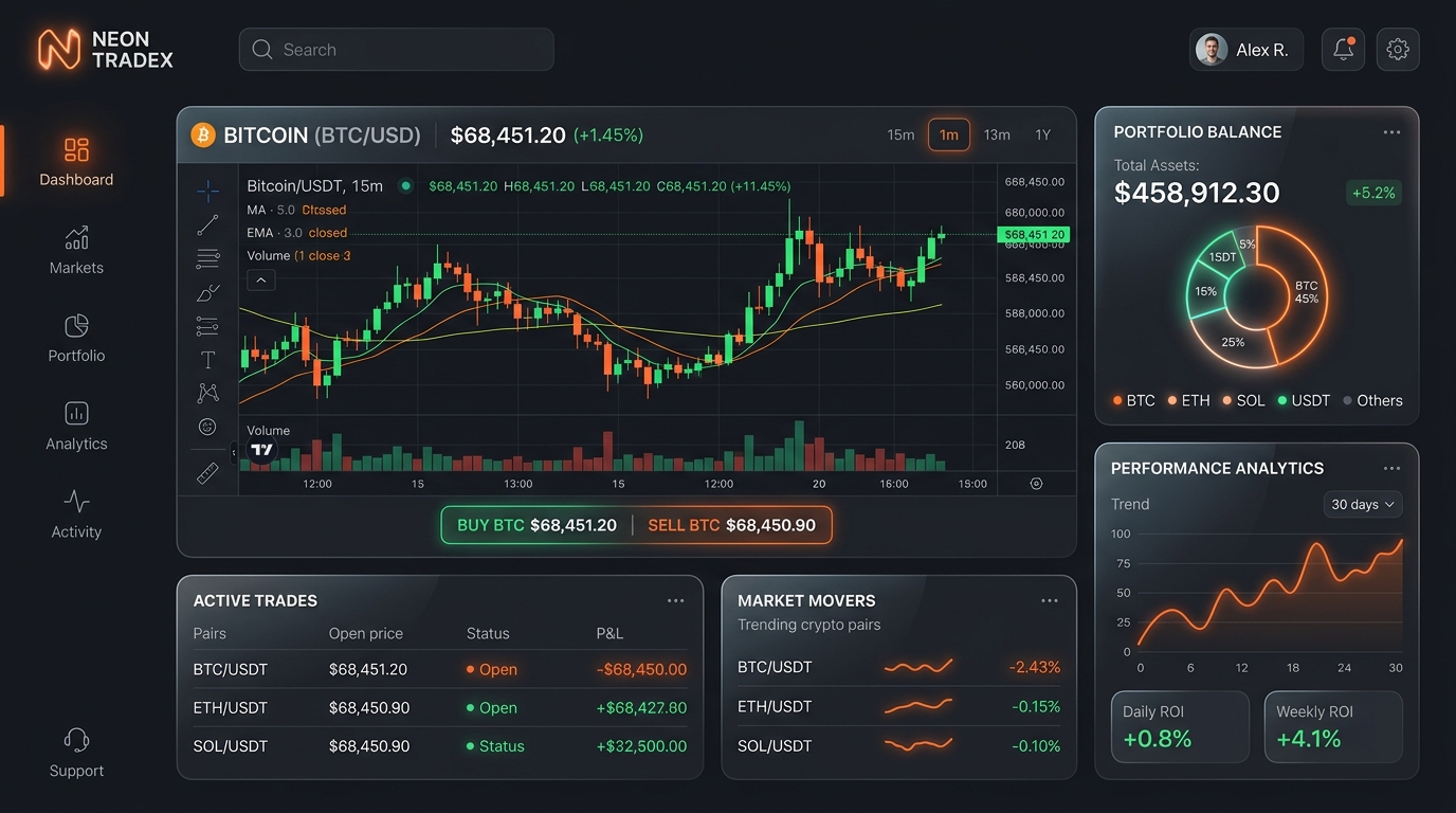
Minimalism combined with elements of modern typography and clean architecture helped us to realize the fintech dashboard exactly as envisioned: visually restrained, yet striking and informative.
Let’s collaborate to build high-conversion dashboards, performant applications, or scalable design systems.
The core aesthetic was finding harmony between clean geometric sans-serif for numerical data clarity and bold display typography for high-impact section headlines.
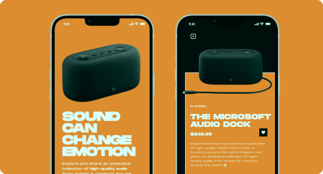
Fig. 1.1 — Component Architecture & Interactive States
Fig. 1.2 — Responsive Workspace & Data Visualization Layout